Download this Jupyter notebook from github
Discovery techniques
Querying the database can be done with anything which support attaching to a PostGreSQL database. Many interface libraries for a variety of programming languages exist, so this is in the end a user’s choice.
That being said, often there are queries which need to be done more often, and it pays off to build convenience functions which wrap a database query. Commonly used query wrapper are found in the discover subdirectory.
Below are a few examples which demonstrate the use of sqlalchemy to perform queries. They make use of the data which has been registered in this notebook. The queries are encapsulated in functions which return an iteratable object which is the result of the query. This is also the same pattern as most functions in the discover directory obey.
[1]:
from geoslurp.config import setInfoLevel
from geoslurp.db import geoslurpConnect
setInfoLevel()

gpcon=geoslurpConnect() # this will be a connection based on the readonly user
Query a single table and visualize the result
[2]:
from sqlalchemy import select,asc
def queryState(dbcon,state):
    """Query the usweedprices2 table for a given state, while sorting the results according to their timestamp"""
    #retrieve/reflect the table (note the lowercase table name)
    tbl=dbcon.getTable('usweedprices2','public')

    qry=select([tbl]).where(tbl.c.State == state).order_by(asc(tbl.c.date))

    return dbcon.dbeng.execute(qry)
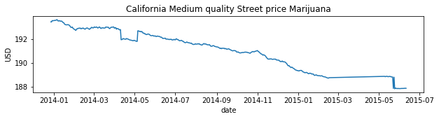
Pick a state and plot the results using matplotlib
[3]:
import matplotlib.pyplot as mpl
from datetime import datetime
%matplotlib inline

statename="California"

t=[]
medq=[]
for entry in queryState(gpcon,statename):
    t.append(datetime.strptime(entry.date, "%Y-%m-%d"))
    medq.append(entry.MedQ)


fig,ax=mpl.subplots(figsize=(10,2))
ax.plot(t,medq)
mpl.ylabel("USD")
mpl.title("%s Medium quality Street price Marijuana"%statename)
mpl.xlabel("date")
[3]:
Text(0.5, 0, 'date')
A more complicated query which joins data between tables
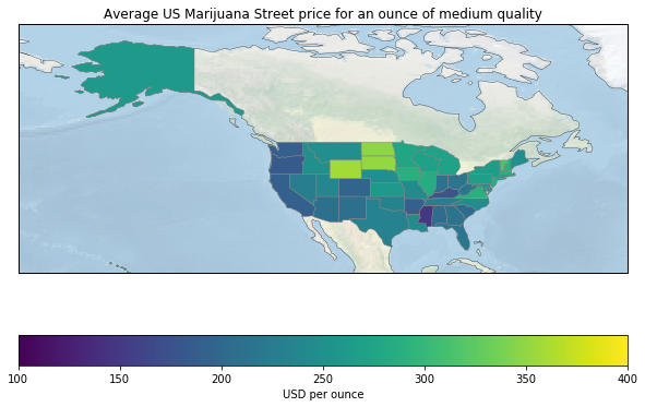
Imagine you want to geographically compare the average street price in 2024 between US states, and geographically visualize this.
This requires a query which computes the average per State and an inner join with a table which contains the polygons of the states.
[4]:
from sqlalchemy.sql import join,func
def queryAveragePerState(dbcon):

    #find the two relevant tables
    usw=dbcon.getTable('usweedprices2','public')
    stategeo=dbcon.getTable('ne_110m_admin_1_states_provinces','globalgis')

    #create a subquery with averages per state
    subqry1=select([usw.c.State,func.avg(usw.c.MedQ).label("avg")]).group_by(usw.c.State).alias("uswt")

    #join the subquery with polygon data from the stategeo table
    j=join(subqry1,stategeo,subqry1.c.State == stategeo.c.name)

    qry=select([subqry1.c.State,subqry1.c.avg,stategeo.c.geom]).select_from(j)

    return dbcon.dbeng.execute(qry)
Visualize the result geographically using matplotlib
[6]:
import cartopy.crs as ccrs
import cartopy
from geoslurp.tools.shapelytools import shpextract
from cartopy.feature import ShapelyFeature


cmap = mpl.cm.viridis
proj=ccrs.EquidistantConic(central_longitude=-100.0, central_latitude=37.5, standard_parallels=(30.0, 45.0))
proj=ccrs.PlateCarree()
mpl.figure(figsize=(10,7))
ax = mpl.axes(projection=proj)
ax.set_extent((-180., -45., 20.,75.),crs=ccrs.PlateCarree())
background=ax.stock_img()
background.set_alpha(0.6)
ax.coastlines(linewidth=0.3)
minprice=100
maxprice=400
for entry in queryAveragePerState(gpcon):
    geom=ShapelyFeature([shpextract(entry)],crs=ccrs.PlateCarree(),edgecolor='gray',facecolor=cmap((entry.avg-minprice)/(maxprice-minprice)),zorder=10,linewidth=0.5)
    ax.add_feature(geom)


sm = mpl.cm.ScalarMappable(cmap=cmap,norm=mpl.Normalize(minprice,maxprice))
sm._A = []
cbar=mpl.colorbar(sm,ax=ax,orientation='horizontal')
cbar.set_label("USD per ounce")
mpl.title("Average US Marijuana Street price for an ounce of medium quality")
mpl.show()